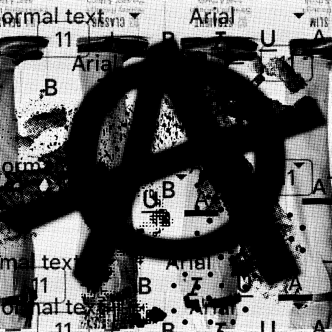
The Arialpocalypse: Default thinking ate the world.
There's a moment when you realize that the thing you've been staring at your entire professional life—the thing that's shaped too many emails, documents, and presentations you've endured—was designed as a cheap knockoff. And that this knockoff somehow became the visual soundtrack of capitalism.
We need to talk about Arial. Not because fonts matter in some precious design-nerd way, but because Arial is the perfect metaphor for how we ended up in this timeline: exhausted, homogenized, and giving up on even the smallest moments of agency. The Dodge Aries K Car of typography has led to the dystopian hell we're wading in right now. See for yourself.
1982: The Birth of a Fake — Monotype creates Arial as a budget alternative to Helvetica. It's not design innovation—it's cost-cutting disguised as progress. The first signal that we're entering an era where "good enough" becomes the standard, where cutting licensing costs matters more than visual integrity. Our cultural immune system to bad design takes its first hit, and we don't even feel it.
1987: The Quiet Invasion — IBM bundles Arial with their printers. Millions of people start using this substitute without knowing it's a substitute. They associate "professional" with "lowest-common-denominator." Default thinking begins its takeover. We stop choosing our tools and start accepting whatever gets chosen for us.
1992: The Windows Coup — Microsoft makes Arial the default sans-serif in Windows 3.1, and the transformation accelerates. Millions of users now equate "professional communication" with this cheap Helvetica clone. The visual language of business becomes the visual language of corner-cutting. We're being conditioned to accept mediocrity as standard, and we don't even know it's happening.
1995: PowerPoint and the Death of Nuance — Arial meets PowerPoint. Every idea has to fit into bullet points formatted in the same sterile font. Complex thoughts get compressed into slide decks. Nuance disappears. Arial trains executives to think in Arial: incremental, risk-averse, corporate. The medium becomes the message, and the message is don't rock the boat. This nautical metaphor extends into the dress code peer preasure that was Docker Khakis.
2000: The First Death of the Internet — Budget-conscious businesses abandon distinctive typography for Arial's false economy. Companies that once had visual personalities start looking identical. Conformity becomes the soundtrack of globalization. In uniformity, we trust. Character costs extra. Personality invites judgment. Better to vanish into the corporate gray than stand out and risk criticism. Dark Web consipiracy theories point to Arial adoption directly resulting in the violent death of the Pets.com sock puppet, but Microsoft Co-Pilot can not confirm.
2008: Austerity Aesthetics — The financial crisis hits, and Arial becomes the font face of survival. Corporate austerity takes hold, and anything that costs extra—coffee, instant oatmeal, first aid kits, and decent typography—gets framed as frivolous. Arial becomes the visual embodiment of "we can't afford better right now." Excellence becomes expendable. Craft becomes luxury. We're not just cutting costs—we're cutting our connection to the idea that how things look matters. The aesthetics of austerity prepare us for accepting less in everything. People keep buying domestic vehicles despite superior, affordable foreign options.
2010: The Cloud Makes Bland Frictionless — This is where our world took a dark, morbid turn. Google Docs cements Arial as the default for everything—from high school essays to venture capital pitch decks. The cloud makes mediocrity effortless and universal. You don't have to choose Arial; it's just there, waiting for you. Default thinking becomes invisible. We're not actively choosing conformity anymore—we're just not bothering to choose at all. Our universal surrender is saved in the cloud.
2016: Flat Design and Political Flatlining — Arial blends seamlessly into the ocean of interchangeable sans-serifs that define flat design. Every interface looks the same. Every brand feels identical. Visual personality disappears in favor of algorithmic smoothness. Once again, Google pulls us down into hell by embracing the aesthetics of bureaucracy—clean, minimal, devoid of character. Political discourse follows the same template. Slogans like "Build the Wall" and "Make America Great Again" feel as institutional and familiar as a memo formatted in Arial. The visual language of authority becomes indistinguishable from the visual language of automation.
2018: Crypto Bros and the Arial Aesthetic — Web3 whitepapers, DeFi dashboards, NFT marketplaces—all defaulting to Arial and its web-safe cousins. Investors learn to trust promises dressed in the typography of institutional legitimacy. Arial becomes the font of digital snake oil. It works because it looks like bank documents, government forms, corporate reports. We've been conditioned to associate institutional typography with trustworthiness. The same visual language that once signified bureaucratic authority now camouflages financial fraud. Only this time it's not just saved in the cloud, but recorded on a "public ledger" that no one can read.
2020: Pandemic PowerPoint — Lockdowns push everyone into full days of Zoom meetings, multiplayer document creation, and presentations. After many months of fussing around in three-day-old pajamas, we start to figure out how in the hell to make Google Slides work—kinda. Arial dominates every screen showing case counts, safety protocols, work-from-home policies, and promises of no layoffs. In crisis, the aesthetics of compliance spread everywhere. We're literally being governed by Arial. The font of emergency management is the same font we use for grocery lists. Authority and banality merge into one interchangeable voice telling us what to do, where to go, how to behave. The movie They Live becomes a documentary.
2021: AI Hype in Default Mode — The AI gold rush produces thousands of pitch decks, product demos, and "thought leadership" pieces—all in Arial. The font's institutional neutrality gives every half-baked AI product the appearance of inevitability. If it looks like a government report, it must be the future. Typography becomes camouflage for speculation. We stop questioning the substance because the form looks so reassuringly bureaucratic. The visual language of progress becomes indistinguishable from the visual language of paperwork.
2023: Enter The Skibidi CEO — A new breed of corporate leader emerges—part hype-beast, part algorithm—all Axe Body Spray—who "gets" modern culture by gutting staff to the Minimum Viable Human count while delivering mass layoffs in Arial-formatted all-hands emails. Come on now, you know that happened! The font that once signaled "professional" now delivers "you're expendable." But it still looks trustworthy—it's the font many of us grew up using—still feels official, still carries the weight of institutional authority. Meanwhile, Founder Mode becomes a thing, but in hindsight it should have been called Arial Mode.
2025: Even the Designers Have Surrendered — Here's the most damning evidence that we've reached peak capitulation: I'm a designer. I work with other designers. People whose entire professional identity revolves around making conscious choices about visual communication. And when we share Google Docs with each other—documents about creative projects, design briefs, client feedback—they're all in Arial.
Every. Single. One.
Jesus wept.
What is going on here?! The people whose job it is to care about typography have stopped caring about typography. We've given up so completely that we can't even be bothered to spend three seconds changing the default font in our own professional communications.
It's as if chefs have resigned themselves to eating fast food for every meal. We know better. We literally teach other people to do better. It's in our DNA, or it's supposed to be! But when it comes to our own day-to-day choices, we've accepted the path of least resistance that grinds against our very existance.
This is how empires fall. For those with a Roman Empire fetish or people who look it up with AI, Diocletian so Arial. He was the emperor who bureaucratized everything, standardized away personality, chose efficiency over excellence, and made conformity mandatory. He looked sensible while systematically destroying what made Rome Rome. Both represent the same fatal flaw: mistaking administrative convenience for actual improvement. Not through dramatic external conquest, but through internal surrender. When the people whose job is to maintain standards stop maintaining them because it's easier not to.
So don't be a dic...uh, a Diocletian.
When designers can't muster the energy to reject Arial in their own documents, the downfall of culture itself is complete. We've been so worn down by the demand to be constantly productive that we've automated away our own professional values. If the data was available I bet it would show that the majority of Pontiac Aztek owners are designers perfectly find using Arial by default.
After decades of Arial conditioning, we accept whatever looks familiar. We trust authoritarian drift because it's formatted in the same font as our work emails. We invest in vaporware because the pitch deck looks professional. We hand creativity over to machines and applaud as CEOs replace humans with "efficiencies"—all delivered in the same bland, comforting sans-serif.
Arial didn't cause this dystopia. But it was the perfect font for it—cheap, familiar, and designed to avoid any visual friction that might make us think twice about what we're reading. And when even the people whose job is to create friction have stopped trying, you know the system is working exactly as intended.
The Anarchist's Cookbook for Fonts
First, start this playlist to get into the mood. Get ready to mosh and burn things down into the...ahhh. Where were we? Oh yes, get ready to make better choices in your career and life.
Defaults are designed to be invisible. That invisibility is exactly why they're powerful. Every time you accept Arial without question, you participate in the great flattening of culture. You signal that "good enough" is good enough, that cutting corners is acceptable, that sameness is safety.
Switching fonts won't topple regimes, but it's a reminder that choice is always an option. Every time you reject the default, you remind yourself that systems can be altered. Your documents might still be boring, but at least they'll be boring on your terms. And stopping this societal slide is super easy to do.
How to escape normcore basic bitch Arial Prison™
In Google Docs: Open any document. Click the font dropdown. Select literally anything other than Arial. Then go to Format > Paragraph styles > Normal text > Update 'Normal text' to match. You've just made rebellion your default.
In Your Life: Start noticing when you're accepting defaults without thinking. Not just fonts—anything. The restaurant the app suggests. The route the GPS chooses. The opinion the algorithm serves you. Defaults are designed to remove friction from decision-making, but sometimes friction is exactly what we need.
Make better, human-centered choices while looking great
Public Sans — Built for the U.S. Web Design System with accessibility and democratic access in mind before Captain Cheeto Donny Clown Pants shut it down. It's public domain, meaning no corporate lock-in. It says "I'm here for everyone," not "I was the cheapest option." And, you paid for it through tax dollars so put it to work.
Work Sans — Geometric precision with humanist warmth. Modern and grounded—it speaks with clarity, not desperation. Open-source, so there's no paywall between you and decent design.
Source Sans 3 — Created for inclusive global typography, supporting multiple languages and scripts. It's Adobe's open-source contribution to making good design accessible worldwide. See, not everything Adobe does requires an annual subscription with a crazy plan cancellation mindfield of dark patterns. Thanks Adobe!
Lexend — Designed specifically to improve reading performance, especially for people with dyslexia or processing difficulties. This font is confident in its purpose, not just its aesthetics. It's accessibility-first design, which is inherently anti-gatekeeping. Also works well for people constantly squinting because they refuse to accept they're getting old.
Changa — A warm, assertive display font originally designed for bilingual Arabic/Latin contexts. It bridges cultural scripts and promotes cross-language inclusivity while maintaining strong personality without aggression. This font makes all the right statements about today's bullshit.
Does this really matter...yes!
Yeah, I get it. Everything is on fire. You're burnt to a crisp. The choice of font might seem trivial, but trivial choices compound into cultural changes. When enough people stop accepting the default, the default stops being inevitable. And that's where we are right now—defaulting.
Arial isn't evil. It's just yucky. The perfect metaphor for what happens when we stop paying attention to our choices. When we accept "good enough" often enough, "good enough" becomes all we get.
But once you see the pattern—once you notice how default thinking operates in fonts, in politics, in technology, in every system designed for your convenience—you can't unsee it.
And that's where real choice begins.
The most subversive thing you can do in a world of Arial is simply choose something else. Not because it will change everything, but because it will remind you that change is possible. Baby steps people. Take baby steps.
Member discussion